Color Scheme Palette
Coolors generates beautiful color schemes quickly using algorithms ensuring designers find perfect palettes every time
English
What is a Color Scheme Palette?
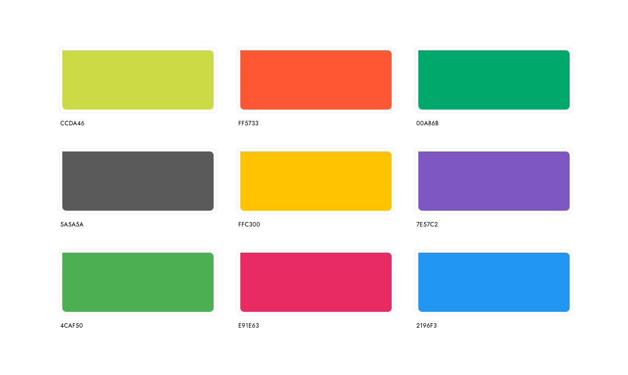
A Color Scheme Palette is a curated selection of colors used in design projects, ensuring visual harmony and coherence. These palettes can be based on various themes such as brand identities, seasonal events, or specific aesthetics like vintage or pastel styles. Each palette includes multiple color combinations, typically in sets of 2, 3, 4, or 5 colors, each defined by their respective codes like HEX, RGB, CMYK, and HSL.
Key Core Functions
Brand Identity: Consistent use of colors across different marketing materials to establish a recognizable brand.
Theme-Based Palettes: Collections tailored for specific events or seasons, like holiday-themed palettes.
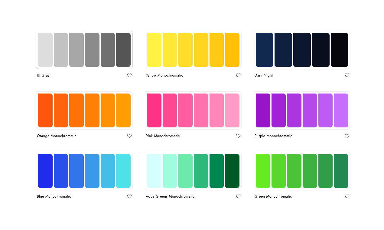
Design Aesthetics: Curated sets of colors for different styles, such as pastel or vintage looks.
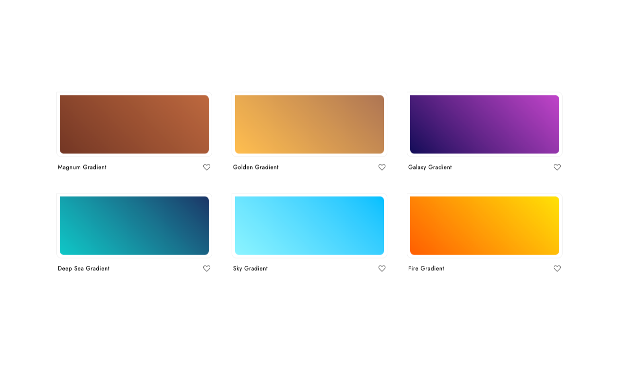
Gradients: Smooth transitions between two or more colors, often used for backgrounds or effects.
Flag Colors: Specific color schemes derived from national flags for patriotic designs.
Use Cases & Applications
Web Design: Selecting harmonious color schemes for websites to enhance user experience and aesthetic appeal.
Graphic Design: Creating visually appealing posters, brochures, and presentations with well-coordinated color combinations.
Product Packaging: Using consistent and attractive color schemes to make products stand out on shelves and attract customers.
Social Media Content: Developing color palettes for posts, stories, and ads to ensure cohesive branding and increased engagement.
User Interfaces: Implementing color schemes in apps and software to improve usability and user satisfaction.
By leveraging these color schemes, designers can achieve professional-looking results while maintaining consistency and visual appeal in their projects.