ComfyUI node interface function description
1019
English
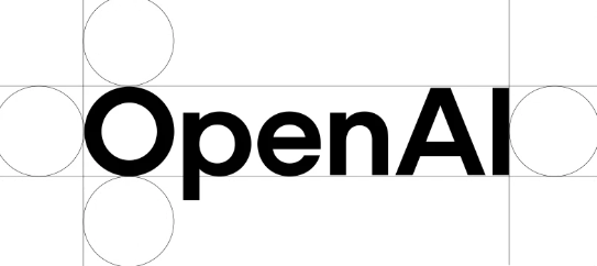
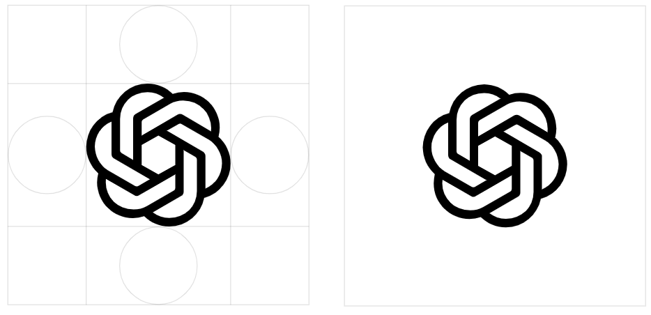
OpenAI carried out a comprehensive brand reshape, and launched a new logo, font and color scheme. According to an interview with "Wallpaper", the purpose of this change is to make the brand image more "organic" and "humanized".
The difference between the new logo and the old version of LOGO is not easy to detect, but through the comparison of side by side, it can be found that the new version of the "flower" pattern center has a slightly larger space and the lines are smoother.
The old version of the LOGO was designed by OPENAI CEO Sam Altman and co -founder Ilya Sutskever. Including Veit Moeller and Shannon Jager. They hope to create a brand image closer to human emotions through new design.
At the same time as the new brand was launched, Openai also showed a new type of font -Openai Sans. This font combines geometric accuracy and functionality, with round and approachable characteristics. The "O" letter in the new Openai logo is perfectly round and round, while the internal is not so regular, thereby offset the cold feeling of the machine -based design and make the brand more humane.
When asked if the AI tool of OpenAI was used in the design process, such as ChatGPT, Moller said that the team mainly used it to calculate the thickness of different fonts.
The designers of OpenAI said: "We cooperate with leading experts with photography, typesetting, sports and space design, and at the same time regard AI tools such as Dall ・ E, ChatGPT and Sora as ideological partners. This human intuition and AI generate potential potential The dual method of method enables us to create a brand that is not only innovative and humane. "