English
English
ComfyUI Settings Menu - Screen
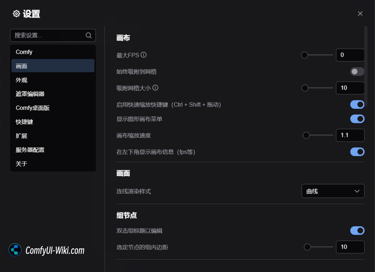
This chapter mainly introduces the description of canvas and graphics-related settings in ComfyUI, which can help you customize and optimize your workflow editing experience.
Canvas
Maximum FPS
Controls the maximum refresh frame rate of the canvas. Set to 0 means no limiting the frame rate.
Grid Alignment (Snap to Grid)
Always Align Grid: When enabled, the nodes are automatically aligned to the grid when they move.
Grid size: Set the size of the grid, the default value is 10.
Fast-zoom Shortcut
When enabled, you can use **Ctrl + Shift + left mouse button to drag (up and down)** to quickly scale the canvas.
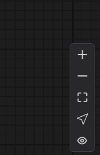
Canvas Menu
Hide or display the canvas menu in the lower right corner of the interface.
Canvas Zoom Speed
Controls the scaling speed of the canvas when using the mouse wheel. The larger the value, the faster the workflow and interface will be scaled.
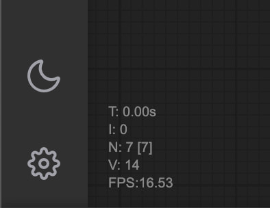
Show canvas information
Display canvas information (such as FPS, etc.) in the lower left corner.
Screen settings (Graph)
Link Render Mode
Set the display method of connections between nodes
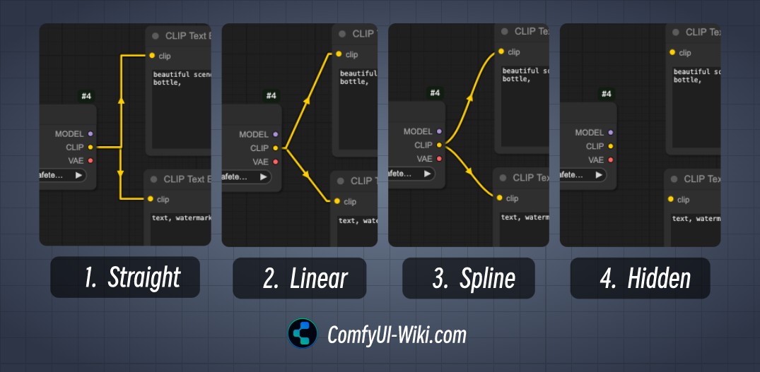
The connected rendering mode is mainly divided into the following types
1. Straight
2. Linear
3. Curve (Spline)
4. Hidden
Hidden mode of the connection cable can be quickly hidden/displayed through Canvas Menu
Group nodes
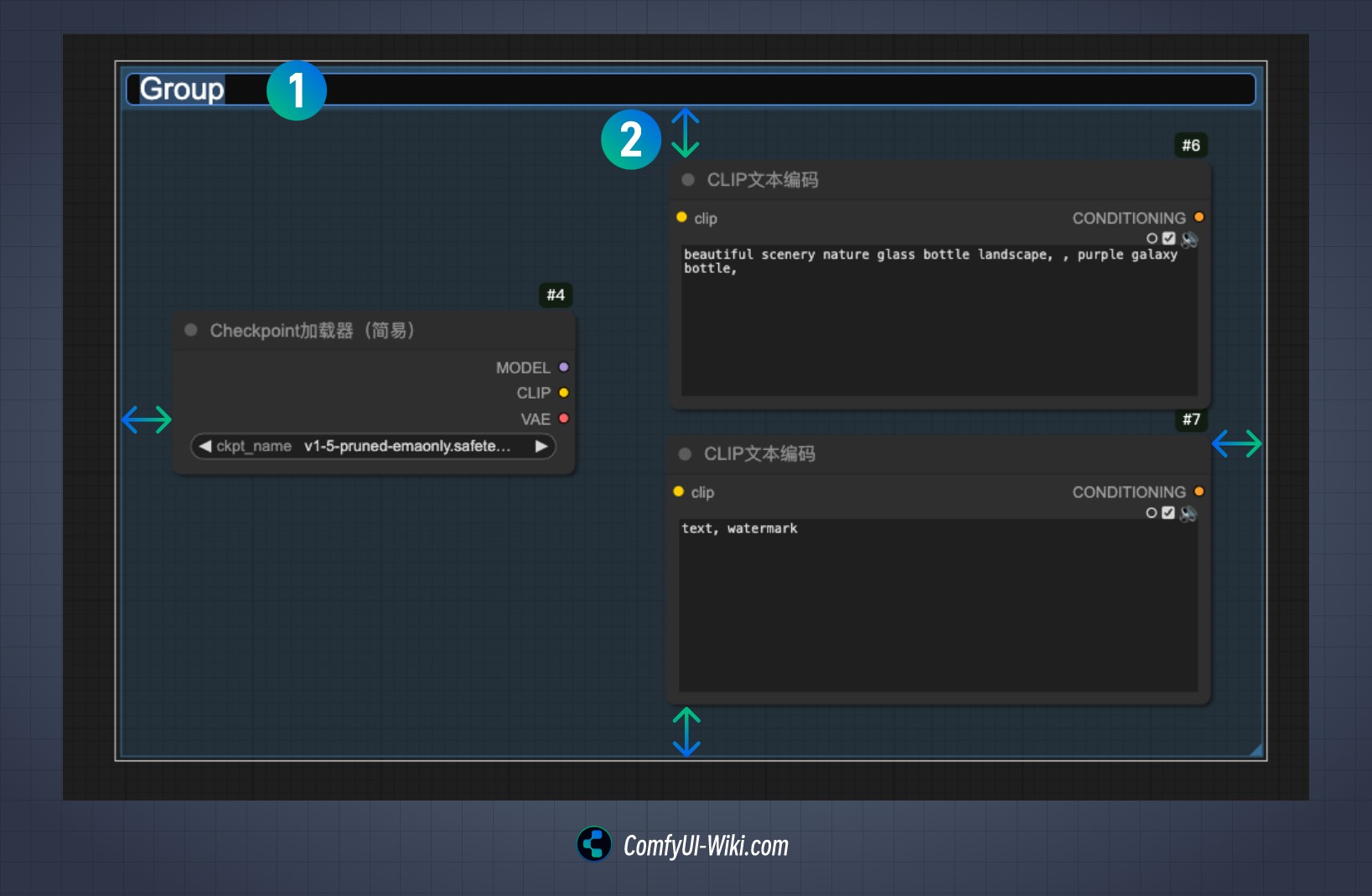
Double-click to edit group title
After enabled, you can edit the title of the group by double-clicking. Serial number 1 is the status where double-clicking the title of the corresponding group can be modified.
Grouping nodes intra margins
Set the inner margin of nodes in the group, as indicated by serial number 2 in the figure. When you select multiple nodes and use Ctrl + G to group these nodes, the default inner margin is determined by this value.
Connection Settings (Link)
Link Midpoint Markers
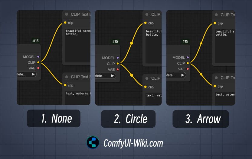
This option mainly affects the style of the middle point marking of the connection line and is divided into the following three display forms
1.None
2. Circle
3. Arrow
Release the link
This part of the settings mainly sets the quick operation of releasing the connection. The difference between the actions is whether you hold down the Shift key when releasing the link is mainly the following three quick operations:
1.Content Menu
Release the menu and evoke the context menu, which contains quick operations and related nodes that can be connected to the current node output/input
2. Search Box
After releasing the menu, the search box will be called, and the current output/input conditions will be added to the filter to facilitate and quickly retrieve relevant nodes that meet the conditions.
The corresponding quick operation will add the corresponding link input/output conditions to the filtering action.
3. No operation (None) No operation
Action when releasing a connection (Shift)
This option sets the Shift when releasing the connection
Actions when releasing connections
This option sets that no modifier key is involved when releasing the connection
Menu Settings (Menu)
Reverse context menu scrolling
Change the scrolling direction of the right-click menu.
Node settings (Node)
When I actually tried many settings in this part, I did not understand the effects of the corresponding settings. If you understand how the corresponding functions work, you are welcome to add the corresponding instructions in the comments in this article. Most of the settings here are convenient and fast operation settings, so it is generally good to keep the default settings.
DOM element cropping
Enable DOM element cropping (may affect performance).
Middle-click to create a redirect node
Use the middle mouse button to click to create a new redirect node.
Keep all connections when deleting nodes
The connections connected to the node will not be automatically deleted. When deleting a node, try to reconnect all its input and output lines (similar to ignoring nodes)
Highlight nodes when aligned
Highlight prompts are displayed when the node is aligned to the grid.
Automatically align the wires to the node slots
It is automatically adsorbed to the nearest node slot when connected.
Enable tooltips
Displays the hover prompt information of the node.
Node production cycle tag
Displays the life cycle status of the node
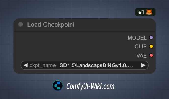
Node ID tag
Displays the unique identifier of the node, and displays #1 tag with a number number as shown in the image to identify the order in which the corresponding node is added to the workflow
Node source tag
Displays the source information of the node and identifies which custom node is the source of the corresponding node (Custom Node)
Double-click to edit node title
After enabled, you can edit the node title by double-clicking to modify the name of the corresponding node.
Node Widget Settings (Node Widget)
Floating point component settings
Decimal places: Set the number of decimal places displayed by floating point numbers (0 means automatic).
Disable default rounding: Disable default rounding behavior of floating point numbers.
Disable the node component slider
In the ComfyUI node, when the option type of the corresponding node is Float type, you can use the left mouse button to hold the arrow of the corresponding input part and drag left and right to quickly adjust the corresponding value. If this disable function is enabled, the slider function of the corresponding value will be disabled
Preview image format
Showing pictures in the image component is, you can use this option to convert the corresponding preview image to a lighter format to bring a smoother interface operation effect Supported formats: webp, jpeg, webp;50, etc.
Pointer
Double-click interval
Sets the maximum time interval to identify the double-click event (default 300 milliseconds).
Pointer click drift (test function)
Click drift delay: 150 milliseconds
Maximum drift distance: 6 pixels
Redirect testing function (Reroute Beta)
Enable redirect testing
If you enable this setting, you can quickly add a transit point by holding down the Alt keyboard on the keyboard (changed to Option key on Mac) and clicking the node's connection line with your mouse