English
English
Appearance menu - ComfyUI Setting menu description
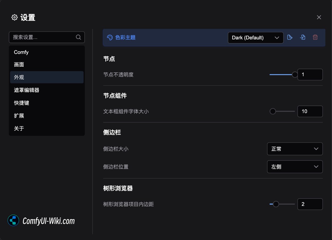
Color Palette
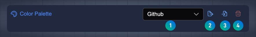
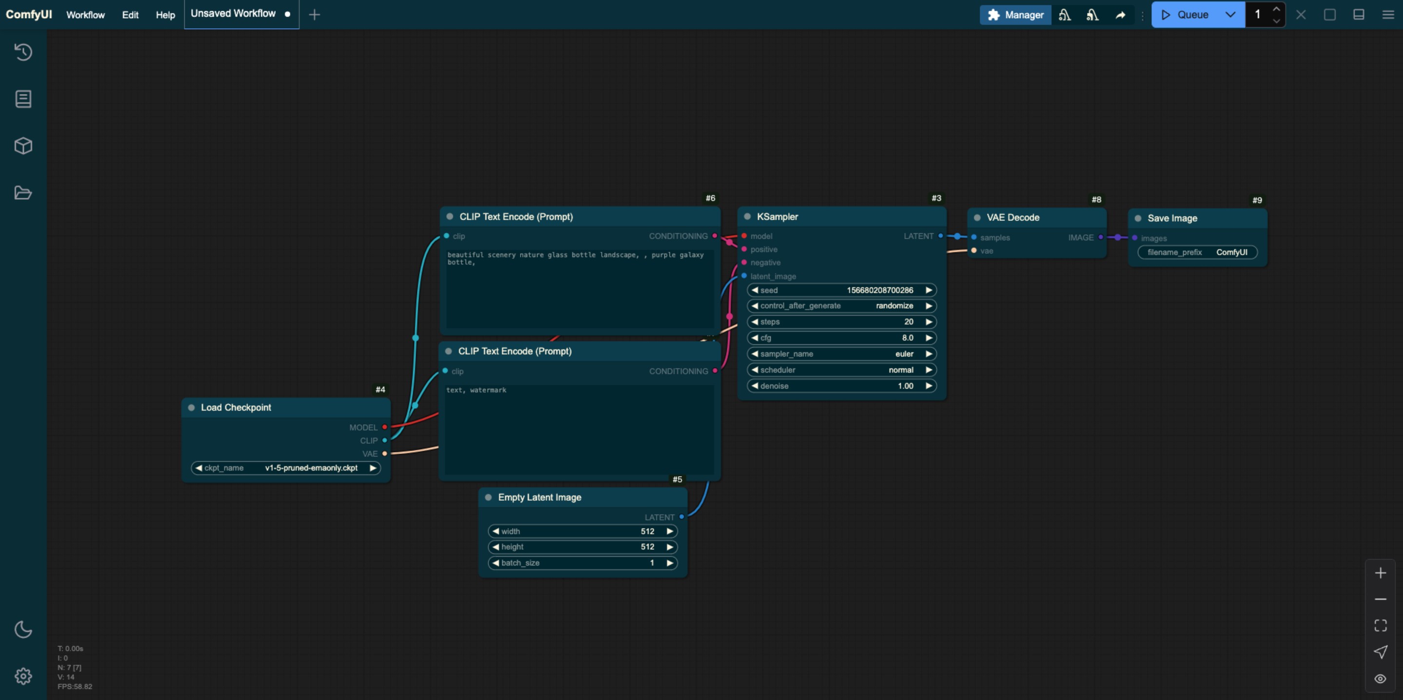
The color palette is mainly used for ComfyUI's overall color theme configuration, and the corresponding menu function is
1. Switch the ComfyUI theme
2. Export the currently selected topic to Json format
3. Load custom theme configuration from Json file
4. Delete custom theme configuration
The main themes currently preset are:
Dark dark theme
Light Bright theme
Arc Theme
Solarized Overexposed topics
Nord Theme
Github style theme
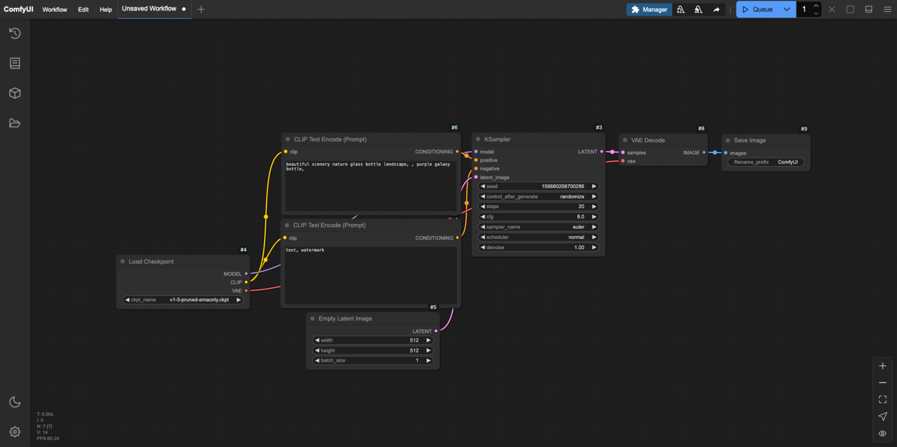
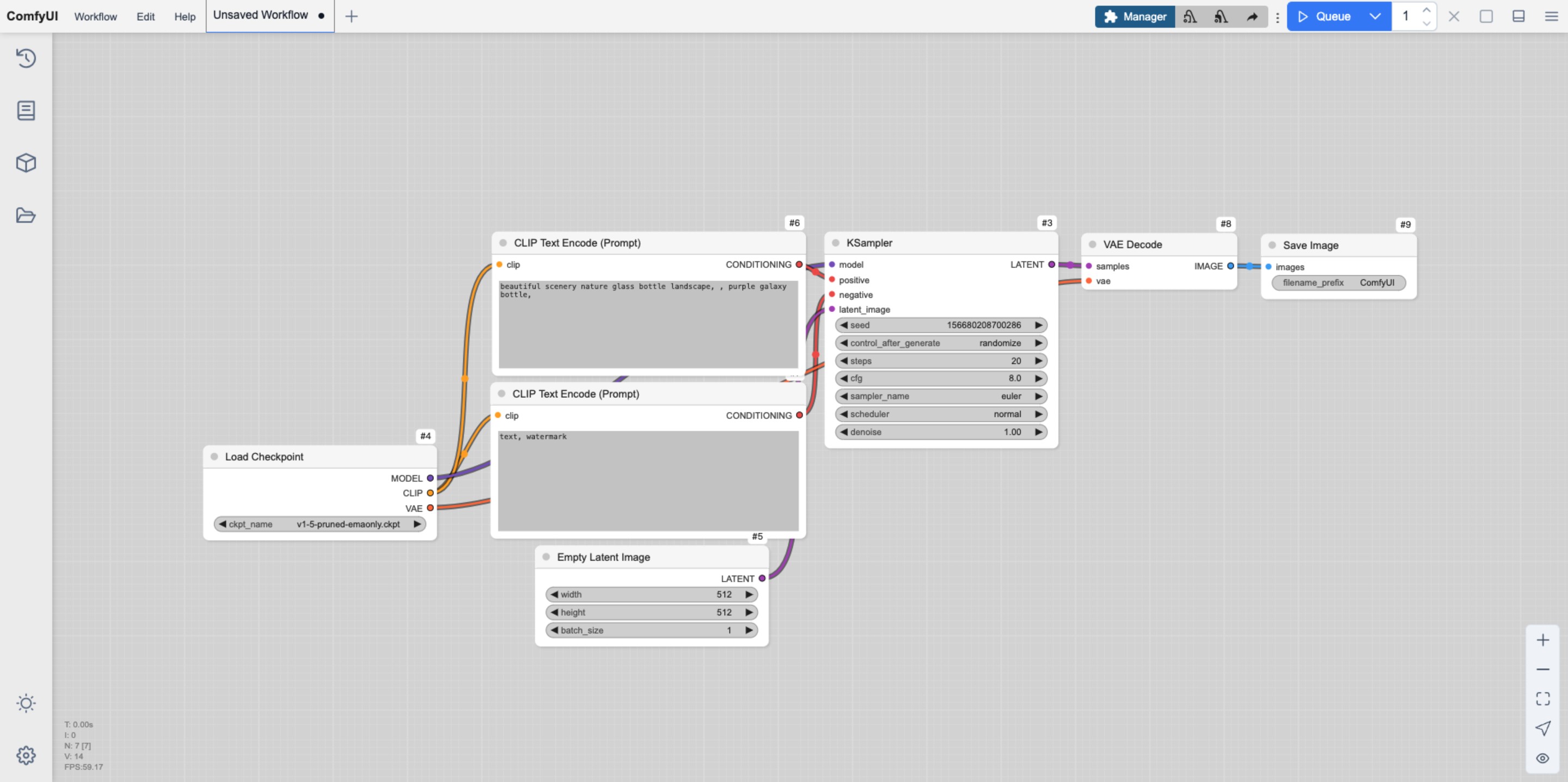
Preset theme style preview
Dark dark theme
Light Bright theme
Arc Theme
Solarized Overexposed topics
Nord Theme
Github Style
How to customize ComfyUI theme styles
You can customize the ComfyUI style by exporting editing and modifying the default theme file. You can edit the corresponding Json file using a text editor or an IDE like VS Code
When editing, please ensure that the content format does not go wrong. In addition, the corresponding id name should be unique. Below is the Json of the ComfyUI Light theme interface I exported. You can refer to the configuration for modification. In addition, since ComfyUI has been updating, the following configuration may not be the latest version. It is recommended to export from the ComfyUI interface for modification.
 {
  "id": "light",
  "name": "Light",
  "light_theme": true,
  "colors": {
    "node_slot": {
      "CLIP": "#FFA726",
      "CLIP_VISION": "#5C6BC0",
      "CLIP_VISION_OUTPUT": "#8D6E63",
      "CONDITIONING": "#EF5350",
      "CONTROL_NET": "#66BB6A",
      "IMAGE": "#42A5F5",
      "LATENT": "#AB47BC",
      "MASK": "#9CCC65",
      "MODEL": "#7E57C2",
      "STYLE_MODEL": "#D4E157",
      "VAE": "#FF7043",
      "NOISE": "#B0B0B0",
      "GUIDER": "#66FFFF",
      "SAMPLER": "#ECB4B4",
      "SIGMAS": "#CDFFCD",
      "TAESD": "#DCC274"
    },
    "litegraph_base": {
      "BACKGROUND_IMAGE": "data:image/gif;base64,R0lGODlhZABkALMAAAAAAP///+vr6+rq6ujo6Ofn5+bm5uXl5d3d3f///wAAAAAAAAAAAAAAAAAAAAAAACH5BAEAAAkALAAAAABkAGQAAAT/UMhJq7046827HkcoHkYxjgZhnGG6si5LqnIM0/fL4qwwIMAg0CAsEovBIxKhRDaNy2GUOX0KfVFrssrNdpdaqTeKBX+dZ+jYvEaTf+y4W 66mC8PUdrE879f9d2mBeoNLfH+IhYBbhIx2jkiHiomQlGKPl4uZe3CaeZifnnijgkESBqipqqusra6vsLGys62SlZO4t7qbuby7CLa+wqGWxL3Gv3jByMOkjc2lw8vOoNSi0czAncXW3Njdx9Pf48/Z4Kbbx+fQ5evZ4u3k1fKR6cn03vHlp7T9/v8A/8Gbp4+gwXoFryXMB2qgwoMMHyKEqA5fxX322FG8tzBcRnMW/ zluulPbRncmQGidKjMjyYsOSKEF2FBlJQMCbOHP6c9iSZs+UnGYCdbnSo1CZI5F64kn0p1KnTH02nSoV3dGTV7FFHVqVq1dtWcMmVQZTbNGu72zqXMuW7danVL+6e4t1bEy6MeueBYLXrNO5Ze36jQtWsOG97wIj1vt3St/DjTEORss4nNq2mDP3e7w4r1bFkSET5hy6s2TRlD2/mSxXtSHQhCunXo26NevCpmvD/UU6t uullzULH76q92zdZG/Ltv1a+W+osI/nRmyc+fRi1Xdbh+68+0vv10dH3+77KD/i6IdnX669/frn5Zsjh4/2PXju8+8bzc9/6fj27LFnX11/+IUnXWl7BJfegm79FyB9JOl3oHgSklefgxAC+FmFGpqHIYcCfkhgfCohSKKJVo044YUMttggiBkmp6KFXw1oII24oYhjiDByaKOOHcp3Y5BD/njikSkO+eBREQAAOw==",
      "CLEAR_BACKGROUND_COLOR": "lightgray",
      "NODE_TITLE_COLOR": "#222",
      "NODE_SELECTED_TITLE_COLOR": "#000",
      "NODE_TEXT_SIZE": 14,
      "NODE_TEXT_COLOR": "#444",
      "NODE_TEXT_HIGHLIGHT_COLOR": "#1e293b",
      "NODE_SUBTEXT_SIZE": 12,
      "NODE_DEFAULT_COLOR": "#F7F7F7",
      "NODE_DEFAULT_BGCOLOR": "#F5F5F5",
      "NODE_DEFAULT_BOXCOLOR": "#CCC",
      "NODE_DEFAULT_SHAPE": 2,
      "NODE_BOX_OUTLINE_COLOR": "#000",
      "NODE_BYPASS_BGCOLOR": "#FF00FF",
      "NODE_ERROR_COLOUR": "#E00",
      "DEFAULT_SHADOW_COLOR": "rgba(0,0,0,0.1)",
      "DEFAULT_GROUP_FONT": 24,
      "WIDGET_BGCOLOR": "#D4D4D4",
      "WIDGET_OUTLINE_COLOR": "#999",
      "WIDGET_TEXT_COLOR": "#222",
      "WIDGET_SECONDARY_TEXT_COLOR": "#555",
      "LINK_COLOR": "#4CAF50",
      "EVENT_LINK_COLOR": "#FF9800",
      "CONNECTING_LINK_COLOR": "#2196F3",
      "BADGE_FG_COLOR": "#000",
      "BADGE_BG_COLOR": "#FFF"
    },
    "comfy_base": {
      "fg-color": "#222",
      "bg-color": "#DDD",
      "comfy-menu-bg": "#F5F5F5",
      "comfy-menu-hover-bg": "#ccc",
      "comfy-menu-secondary-bg": "#EEE",
      "comfy-input-bg": "#C9C9C9",
      "input-text": "#222",
      "descript-text": "#444",
      "drag-text": "#555",
      "error-text": "#F44336",
      "border-color": "#888",
      "tr-even-bg-color": "#f9f9f9",
      "tr-odd-bg-color": "#fff",
      "content-bg": "#e0e0e0",
      "content-fg": "#222",
      "content-hover-bg": "#adadad",
      "content-hover-fg": "#222",
      "bar-shadow": "rgba(16, 16, 16, 0.25) 0 0 0.5rem"
    }
  }
}
Node
Node opacity
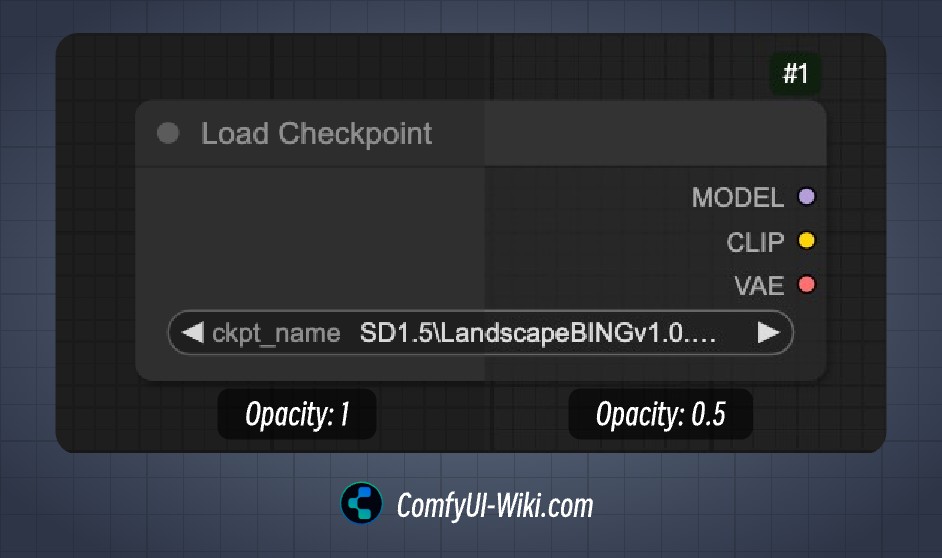
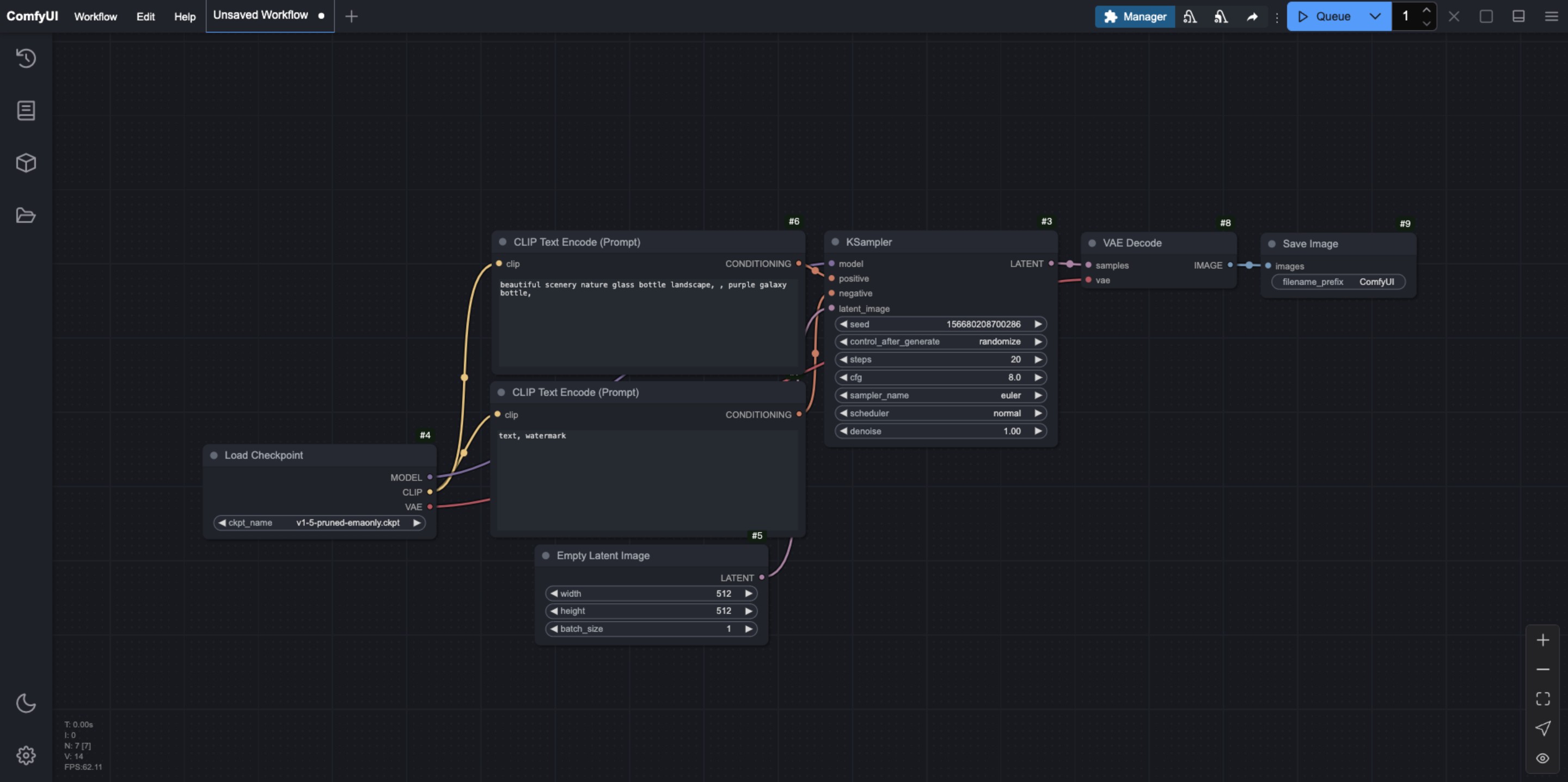
This option mainly affects the background color transparency of the node. The smaller the value, the more transparent the background color.
Node Widget
Text box component font size Textarea widget font size)
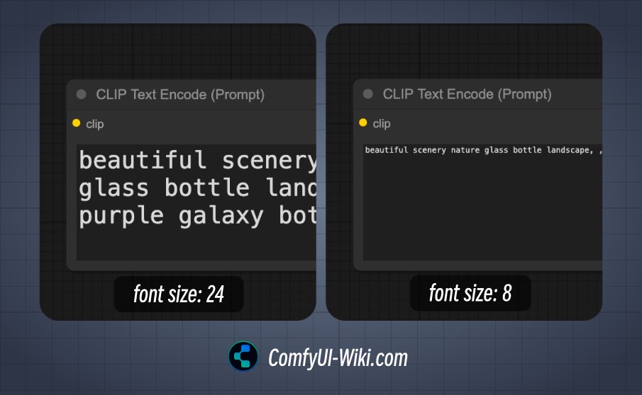
When the corresponding node has text box input, this option is used to determine the font size of the corresponding text box, the minimum is 8 and the maximum is 24.
Sidebar
Sidebar size
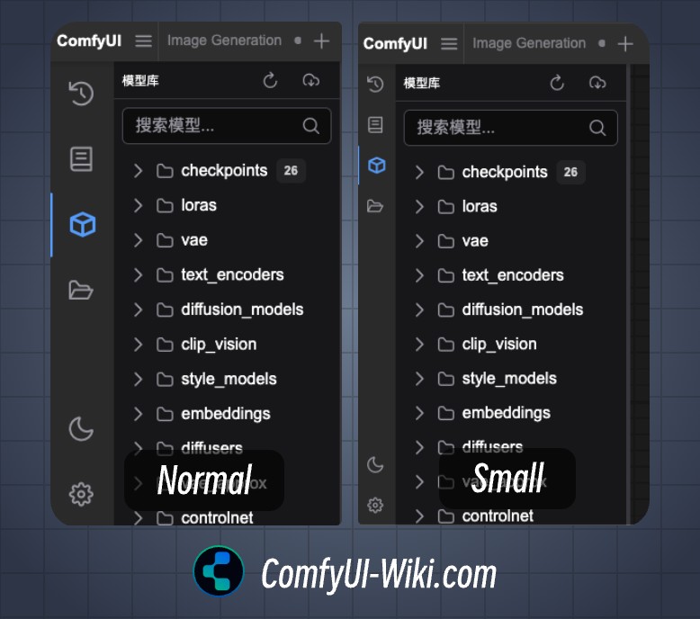
Sidebar size condition
Normal: Normal sidebar size
Small: Small size sidebar
Sidebar location
Sidebar location, left/right
Tree Explorer
Tree explorer item padding
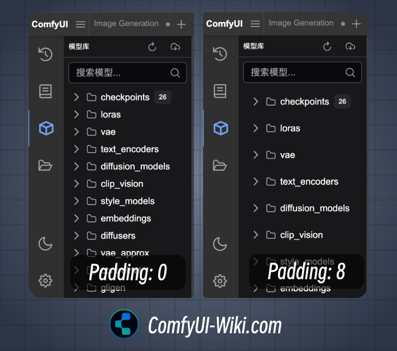
Set the inner margin of the sidebar menu, support the inner margin setting of 0-8